Friday, 12 February 2010
Monday, 8 February 2010
Thursday, 4 February 2010
Coursework Evaluation Question 3
What have you learned from your audience feedback?
My audience feedback I think will be the main factor to determine whether I have achieved my goal of creating a children's TV drama opening sequence which would be targeted at 5 - 11 year old children.
I gained feedback from my class by letting them view the video first and giving them a blank sheet of paper to write down their thoughts on the video. From the feedback I received from my class, I recognised that on a majority verdict that there were a few points that were mentioned in more than one persons verdict which I thought were the most important to evaluate.
But, I had to take into consideration that my feedback would be less valid in this case as the audience I was questioning was of a different age range to my targeted audience, this ranged from age 17 - 19. Another problem with using this age range for my audience feedback would be that they may have too much cultural capital and expect a much more complex video and therefore with our video being simplistic they are likely to take an aberrant reading from it. Because of this, I carried out further research to gain more audience feedback but from children within my target range which is evaluated after my initial class research.
The first feedback note that I received which was also mentioned in several others was that the video on a whole was a bit too simplistic. I thought that this was an important point to consider as we were unsure in the initial planning and research part of our coursework if we were to use a simplistic or complicated approach to it. We noticed from researching existing children's TV dramas that generally they were all quite complicated and there was a lot going on in every one we viewed. But, we did come to the conclusion that we wanted to differentiate from existing TV dramas and not use the stereotypical style which is carried out through many others.We would also use this oppositional style as recognition to our programme from our target audiences perspective.
The second feedback point i received which I thought needed to be included in my evaluation was that the use of fast editing was a good way in which to keep people's attention purely on the screen. We used this to create a direct effect on the audience and to add a bit of energy to the simple idea we had. Also throughout our initial research and planning for our coursework we noticed that the use of fast editing bought new colours, shots, animations and characters into the frame very quickly so that the target audience doesn't have to view the same thing for a long time and therefore getting bored and maybe not watching the programme. We thought this was very important and recreated that style within our coursework using fast editing into different coloured backgrounds, different shot types and different characters to offer lots of different pleasures in a short time from our video.
The third point made by the class audience which I thought was valid to be included in my evaluation was that the characters weren't introduced properly. We wanted to do this on purpose and expected people to comment on it from the age range of our class when carrying out audience feedback. This is because they take a different reading towards the media text and have a much more developed cultural capital and therefore their expectations of reading the text would be of a higher standard than the age range we were targeting. Therefore, we came to the conclusion that this point would be much more valid to us if a target audience member had commented on the same problem. We thought that the age range we're targeting need an obvious reason given to them to keep watching on. This we decided would be keeping the character's names anonymous until the start of the actual programme. We used this as we expected the target audience to read the text with receiving pleasure from the fast editing, use of bright colours and the fun, happy atmosphere we tried to create and therefore would want to watch further in to find out the names of the 'lucky' boys who have this fun, happy lifestyle which was created by the use of luxury props like pool tables, game consoles and darts boards etc.
The fourth and final point I wanted to evaluate from my class audience feedback was that the editing of the video working well with the soundtrack. This meaning that of each change of tempo, pitch or volume in the song there was a fast cut. We had to use a fast and jumpy soundtrack not only to create the fun, happy atmosphere we were aiming for but to keep up with the fast editing we wanted to achieve within or video. When researching initially into existing children's TV drama soundtracks we found they lasted on average from 10 we recorded, 23 seconds. We have many frames we wanted to include in our video and to fit them all in using fast editing we had to find a high tempo soundtrack which we did and we think it works well.
Next, I carried out a discussion with some children within my target age range. These were the points that would be more valid to us in making our decision in whether we had been successful.
I wanted to carry out a discussion because in that way it would allow the children to develop their answers and not give them closed questions which would end up in being qualitative data which is not what I wanted as it would take vast amounts of time and money which at this level would be not possible. Quantitative data allows people to be more specific on the particular part of the video they're evaluating.
We started on Saturday 26Th February at the location of all the filming for our coursework video and had a group viewing of the video first. The people within the audience included our two neighbours which were also the actors within our video names Ashley and Dominic. The next audience memebers were family members of mine being theree of my cousins names George, Louis and Josh. Lastly I used my sister who is called Natasha.
We viewed the video initially on the largest TV we have in the house so everyone had a clear view of the video. During this time I thought it was important to study the audience's reactions as the video progressed and it definitely became apparent to me that the reactions were much more enthusiastic from the younger audience members. I put this down to that they would take a different reading of the text to the older members as the maturity levels are higher in those which are more older. I also used this observation to evaluate that the younger members took much more of a preferred reading of the media text and that they received much more pleasure from it than the audience members at the peak of my age range. I used these observations to say that I think that if I were to carry this out again I would change my age range from my first observations to a shorter span around the younger ages.
Then, I started the conversation by asking a few trigger questions to get everyone involved. I asked simply if they enjoyed watching the video as it is a simple and understandable question for their ages. Louis one of my cousins only aged 5 mentioned that he like the 'flashing' (fast editing) and how colourful it was. Then another of my cousins which is age 12 at the top end of my age range said that he did not understand the storyline. From this I could see that the age difference was a major factor in the way that the text was being read by my audience and that the older members were assessing it more in depth than the simple aspects of colour like the younger members were.
It became apparent to me that this trend followed throughout the questions with the older members of the audience coming up with more technical answers which I found hard to take on board as the younger members didn't understand as their knowledge of terminology and vocabulary was less broader than the older members which also supports my decision to use a shorter span of age ranges and keeping them of a lower age. But, I did target my audience to be of ages between 5 and 12 years old so I obviously didn't succeed at that and didn't include enough to pleasure the older audience members. This I think though would be tough because it risks confusing the younger members which have not got the amount of cultural capital the older members have and may risk loosing their attention from the video.
Coursework Evaluation Question 2
How effective is the combination of your main and ancillary tasks?
Having to create two ancillary tasks along side my main task meant that i needed to follow a house style throughout all of my tasks to make them easily recognised as being associated with each other and ultimately the programme they would be marketing. They worked together by following certain aspects of each task which made my programme unique throughout all of my tasks.
The first was the colour scheme and font of the logo representing my programme. This was essential in the branding of the programme and needed to be the same throughout so not to cause confusion over what the different tasks were marketing and especially as our target audience was of such a young age.
I also decided to follow the same background theme throughout all of my tasks being the multi coloured 'blob' effect as I think it stands out the most from all of the components making up the tasks and therefore would be a good way to use as something which would be recognised and associated with my programme I am essentially marketing through my ancillary tasks.
I also decided to keep the same clothing on the actors for all of the different tasks as it will help such a young target audience like our to recognise the characters from our programme more easily.
We wanted all of our tasks to be consistent and aesthetic is carrying our house style throughout and we determined that through the audience feedback we had. The target audience group I discussed my video task with agreed that all of the tasks went well together and therefore in media terminology were successfully coherent.
I think that throughout the course of the making of the video and ancillary tasks it had come more apparent to me that it is very important to make sure all of the tasks are coherent and can easily be related to each other and the different conventions in each are included in all of the tasks to help brand the programme. Therefore I think in conclusion that if I were to carry this out again I would of taken more time in the research and planning stages to make sure that my house style was carried through all of my tasks more effectively and thought about it in more detail like positioning and sizes of the different conventions that branded my media product.
Coursework Evaluation Question 4
How did you use media technologies in the construction, research, planning and evaluation stages?
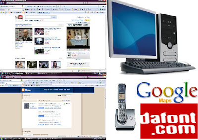
Above is a collage of images representing all of the media technologies I used during the research, planning and evaluation stages of my media coursework, this was created using Adobe Photoshop CS2.
The media technologies both physical and digital we used includes the internet, telephone communications and computers with mouse, keyboard and desktop.
With these different new media technologies being available to us we have been able to execute our plans for some of the more technical aspects of our video and print production coursework.
This includes using the green screen technology in using Adobe Premier Pro 2.0 which was essential in the editing stages of our video. Also the advanced editing tools which were used using Adobe Photoshop CS2 to ensure of the best quality of image was achieved through careful editing.
Another factor of new media technology which was essential in the evaluation stages of my coursework was media 2.0. I was able to easily gain peoples comments by using social networking site 'Facebook' and through comments left of my video and print production work through my blog and 'YouTube'. This new media technology also enabled me to access a much wider number of people to give me their views without having to physically find them and therefore I will have a much more valid conclusion to the sucess of my video through many more opinions being recieved.
When caputring our images that we would use in our video coursework we had the luxury of being able to use HD cameras for this and therefore were able to prodcue a very high quality image and improve the overall quality of the video making it look much more professional.
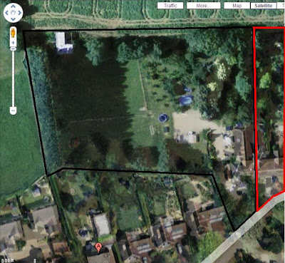
Using google maps I was able to very easily obtain a map of my neighbours house and mine as in the research and planning stages this was necessary when expalining why it was so convenient that my actors live next door but one to my house. By using this service I was also able to give an accurate image and a more professional look in my research and planning stages.
I was also able touse a website called www.dafont.com. This was used by many students and offers many fonts that you can download and use in your coursework. This enabled us to pick a font which would represent our programme and give a unique aspect to it and creating a brand recognition. So through using this site with nerw fonts we were able to acheive this. and therefore without it we wouldve had to use a standard font which would be used by other people and give a less professional and quality look.
Coursework Evaluation Question 1
In what ways does your media product use, develop or challenge forms and conventions of real media products?
Question 1 Media Evaluation
View more presentations from sammiguel92.
Thursday, 28 January 2010
Question 2 - House Style
The most important aspect of our house style which would be use in all promotional material would be the type face of the logo. We used a font called 'ICE AGE' which is very similiar to one used in another children's film which is well know to most children.

The next aspect of our children's TV drama which would be used in all marketing material would be the colour scheme. We have used the same colour scheme throughout all of our print production tasks to create a recognisable house style.

Tuesday, 1 December 2009
Organisation Problem In Adobe Premier Pro
We are now in the early stages of editing in Adobe Premier Pro for our main filming production work and have come across a problem that we initially planned to organise our clips into the task bar to ensure there was no confusion in which clip contained what. Unfortuanetly we did not do this and have come under great confusion to what each clip holds. Because of this we have named each clip more specifically so that they are easily identified to us and will also speed up the editing process.
Wednesday, 25 November 2009
Copyright & Permission
I have enclosed the letter asking permission to the parents of whose two children we will be filming in our coursework. This letter includes the signatures of the parents to allow their children to be filmed.
We also chose a soundtrack from a non-copyright music website and edited it which we were able to do and use because no one has the rights to it. We chose the soundtrack by selecting from a selction of subheadings containing different genres. We chose the one that stated 'TV Themes' because we thought that it applied to our coursework idea the most. From process of elimination through 4 potential soundtracks we then chose this one. We chose this one bover the others because we belived that the high tempo and rushed atmosphere made it stand out from the rest and also would be suitable for our target audience as it would allow us to create alot of fast cut editing to help create the fun, jumpy, happy atmophere we plan to create in our coursework and to also help keep the viewer interested.
http://freeplaymusic.com/search/category_search.php?t=v&i=5
Top Left Soundtrack - To Listen Click Preview
Tuesday, 17 November 2009
Audience Effects Theory
Media influence or media effects refers to the theories about the ways the mass media affect how their audiences think and behave.
Mass media plays a crucial role in forming and reflecting public opinion, connecting the world to individuals and reproducing the self-image of society. Critiques in the early-to-mid twentieth century suggested that media does not have an effect on the way in which people behave.
Being aware of the effects on my audience when consuming my coursework task is very important. I need to ensure I create the right effect on my audience and the one I am planning to achieve. This is to keep my young audience engaged throughout because of the young age they can easily be distracted. I will dreate this effect by including many different colour schemes, fast editing and both real life filming and animated designs.
I think that I will be sucessful as long as I keep in mind the effect I want to acheive on my audience because it may contain alot of different aspects in order to keep my particular target audience interested but it must also be short and fast so there is never a boring, slow part to it. I also have to keep in mind that as found in effects research that not all audiences are the same so the diverse choice of content ideas will have to be encorporated sucessfully to satisfy more than one person's needs.
If i do not sucessfully acheive this effect on the audience then I am at risk of not keeping my audience interested and not having good feedback on my coursework. On the other hand it will give me a much better idea on what it would take to satisfy all of my audiences needs from finding out what failing from the first task.
Monday, 2 November 2009
Research Into Exisiting Children's TV Dramas - Tracey Beaker Inspiration
To help us to get an idea of what children should expect from our tv drama we researched into what makes up an exisitng children's drama.
We firstly researched into the children's TV drama Tracey Beaker which influenced our decision making within our coursework alot. We found that aspects of the opening sequence of this drama contained alot of our existing ideas but adapted to that particular show in a different way. For example we aimed to use a mixture of cartoon animation and real life video footage together throughout the opening sequence to create a sense of realism but still adventurous to attract or keep the attention of the children watching.
Below I have inserted the opening sequence to the children's drama which we have used alot fas a base of our inspiration for our own projects. We have recognised that the aspect of movement plays a big part in keeping the audience interested. They use alot of montage editing, colour themes and camera angles to keep each frame busy and colourful so ultimately the viewer does not loose interest. We thought this was very important and therefore we would be trying to acheive this within our own opening sequence but in a way that is unique to our project. We will achieve this by using the cartoon montages around the real life opening sequence to be related to the surroundings, for exmple if being filmed playing football then small cartoon footballs will be montage edited into each frame.
Sunday, 1 November 2009
Research Into Existing Children's Tv Dramas - My Parent's Are Aliens Inspiration
When watching this children's TV drama opening we found our inspiration for using the cartoon house having an animated movement into the opening frame. We wanted to use this effect as we think it connotes adventure and creates expectations of a fun, exciting and unpredictable show.
We therefore used the programme 'Premier Pro' after a quick tutorial from our teacher on how to use the 'green screen' effect, to create a prototype of the effect we are looking for.
Below is what we achieved...
We therefore used the programme 'Premier Pro' after a quick tutorial from our teacher on how to use the 'green screen' effect, to create a prototype of the effect we are looking for.
Below is what we achieved...
Shot Log
By using my research and planning into existing children's TV dramas I was able to come up with a list of shots I will use throughout my coursework in both my main peice and my print production tasks.
I noticed that when researching into the magazine of Doctor Who and Tracy Beaker I found that the shots taken of the main characters were mid shots and larger than any other image on the page to connote importance and to show to the reader who is the main character. For my print production task I will be using two-shot of both the main characters to make the viewer know they are the main characters.
I will be using a stock motion animation by using still images of one of the characters running with a football and then by switching to a point of view shot of the character behind the ball and zooming as it goes into the net.
I will also be shooting using various still long shot images in my establishing shot of the two characters throwing a pile of leaves into the air to connote freedom and the space they have in their new home and creating a sense of happiness.
I will be shooting both characters in a low angle shot in a jacuzi outside with a large amount of bubbles used to connote fun and create a happy atmosphere. I will use this shot to make them look much larger and again connote happiness and make the viewer feel the happiness the character's are.
The next shoot will be taken on a trampoline where a low angle shot once again will be used to connote power and to create a dominant atmosphere where they feel on top of the world in their new amazing home.
We chose to use stock motion animation within our coursework as we think it is very effective when used in Tracy Beaker's opening title sequence when viewing it within our reserach and planning into existing children's TV dramas. We also think that the upbeat, 'jumpy' soundtrack we have chosen for our coursework will benfit from fast editing and by using stock motion animation there will always be something going on to keep the viewer interested.
Monday, 19 October 2009
Question 1b:media language & audience
The way in which I used colour helped me to target the specific audience i was targeting. I noticed through my research prior to my AS production that the troubled youth audience I was targeting, the media products already on the market targeting them used a range of darker colours like blacks, blues and reds.
Font Research


I have research into various fonts in which I think would be appropriate in attracting my target audience in my media product. I am looking to create a very messy, jumbled up atmosphere on the magazine cover and DVD cover to help interact with my audience more effectively. I think that the following styles will be contenders for the appropriate style I am trying to achieve which is a child like, messy and random style.

By analysing the fonts i researched into allowed me to come to the conclusion that the 'ICE AGE' font would be best suited for my target audience.
I think that the bold, rough edged font would be suitable because it almost looked like one of my target audience members had drawn it and it would create a comfortable atmosphere for the target audience as they would be used to writing like this at the age group I am targeting.
I will also be able to use this font to make a unique logo for my media product which will brand my product.
Saturday, 17 October 2009
Organisation of locations, costumes and props
We came up with a list of possible locations which would be suitable for our coursework idea. These were both of our own houses and a local childrens nursery. We realised that the legislation we needed to complete was all too unecessary bother for some filming so we narrowed the search down to the two houses. We agreed on using my house as we wanted to create a happy and fun atmosphere within our coursework and after weying up possible shots in both houses we decided mine had more potentially effective shots. This is because of the space we have to work in, the props that are easily available to us and there is no travelling around inviolved so no problems would occur in the transportation of equiptment or communication.
Dmonic Jones Aged 13
In the map below using a screen grab from www.google.co.uk/maps I have outline the boundaries of my own home which is outlined in a black line to show the area we will be using for filming. I have also used the screen grab to show using a red outline the boundaries of the home of the two boys we will be using within our filming in our coursework.

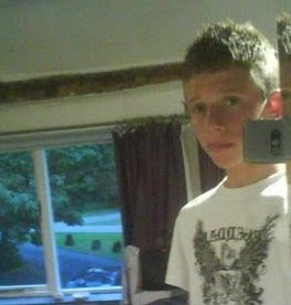
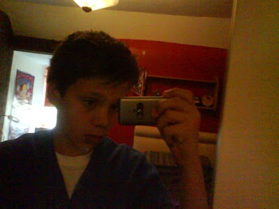
We then chose our actors to be two of my close neighbours, Ashley aged 15 and Dominic aged 13. We decided they would be suitable as they both look quite young and would appeal to our target audience. It was also very convenient as they live so close to the location of the shoot so communicatioon would not be a problem here.

Ashley Jones Aged 15

Dmonic Jones Aged 13
We then came up with a list of shots which is enclosed in a seperate blog http://sama2coursework.blogspot.com/2009/11/shot-log.html
We then decided on props that will need to be used to create the effect we wished for. We therefore came up with this list of props that will be used within shots to help create the right effect and atmosphere we hope for.
Pool Table and Cue
Trampoline
Bar Football Table
Sofa
Plasma TV
Jacuzi - located outside so depending on weather conditions ont he day of the shoot
Darts Board and set of darts
We then came to the conclusion that in order to create a happy and fun atmosphere they should be dressed in casual everyday clothing and no particular costumes will be needed to ensure the opening sequence is not over glamourfied and that it applies to the lifes of children today.
Friday, 16 October 2009
Magazine Cover Task Research And Planning
I looked at two magazine covers and two DVD of two of the most popular existing children's TV dramas, these being Tracey Beaker and Doctor Who. Below I have inserted into my post the two latest DVD covers for both series and from these I have recognized and extracted certain conventions I wish to use in my print production task.
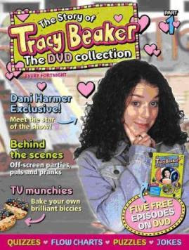

I straight away recognised from glancing over both magazine covers that they were both very jumbled up covers and there was no sense of order to both of them. This allowed me to conclude that this strategy is used to attract the target audience because it looks like there's alot going on and will not make the reader bored quickly.
I then noticed that both magazine covers had the main character's images taken in mid shot. This is effective as it uses a direct adress to the audience and connotes importance of that particular character taking up a large part of the page compared to anything else.
On both covers the layout was almost chaotic and very informal with a mixture of animation, images, and graphics. The trarget audience as it gives them more to look at and I think that with the target audience we are both trying to attract that quantity is an important factor from analysing both magazine covers. This is mopre important than the quality of the text because the target audience age we are targeting will be more intetrested in images and colour than reading.
A convention I am keen on using is the cover lines used to form a menu back at the bottom of the page on the tracy beaker magazine. This is used in bold, clear text and lots of colour to help attract the reader to look inside by giving a taster and creating expectations of the magazine.
I also noticed how lighting was used in the Doctor Who magazine front cover to connote danger which is trying to be acheived by the expression on Doctor Who's face, the colors of red and orange used, the sci-fi creature used and the strapline reading 'RED ALERT'.
Thursday, 15 October 2009
DVD Cover Task Research And Planning
I looked at both Tracy Beaker and Doctor Who for research into my DVD cover print production task too as I wanted to see if there was any correlation between the two after finding many similarities within the magazine cover task research.
Below I have inserted for both Tracey Beaker and Doctor Who a recent DVD cover from each programme.

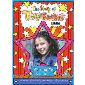
Staright away I can recognise that there is no real similarities in the layout of the DVD covers to the layout of the magazine covers. The DVD covers are much more simplistic and in a formal order. They both contain conventions of a children's nature though as both are targeting the same audience.
I also notice that both dvd covers use mid-close up shots of the main characters which are both situated in the near centre of the page. This is to give the audience background information on what characters to expect and the genre of the dvd they are looking at.
Audience expectations are also created through the dvd covers and the simplistic layout and mise en scene surrounding the characters. This is because of the target audience being children that they want to give an idea of what to expect but not too much as they want the viewer to be stuck to the prgramme and not know what will happen next as children can become restless quickly.
I also recognise the use of background lighting on both character images, this is used to create a bold effect and make the characters stand out as the establishing shot of the whole dvd. It is also used todraw the target audience's intrest the dvd and look eye catching.
Below I have inserted for both Tracey Beaker and Doctor Who a recent DVD cover from each programme.


Staright away I can recognise that there is no real similarities in the layout of the DVD covers to the layout of the magazine covers. The DVD covers are much more simplistic and in a formal order. They both contain conventions of a children's nature though as both are targeting the same audience.
I also notice that both dvd covers use mid-close up shots of the main characters which are both situated in the near centre of the page. This is to give the audience background information on what characters to expect and the genre of the dvd they are looking at.
Audience expectations are also created through the dvd covers and the simplistic layout and mise en scene surrounding the characters. This is because of the target audience being children that they want to give an idea of what to expect but not too much as they want the viewer to be stuck to the prgramme and not know what will happen next as children can become restless quickly.
I also recognise the use of background lighting on both character images, this is used to create a bold effect and make the characters stand out as the establishing shot of the whole dvd. It is also used todraw the target audience's intrest the dvd and look eye catching.
Wednesday, 14 October 2009
Time Schedule Of Production
We have come up with a time scale which we think is appropriiate for our coursework after taking into consideration and estimating the time taken to complete each task.
28th September - 5th October the first part of our coursework and first deadline we have to meet is the creation of our pitch for our coursework idea and our treatment. This was scheduled by the teacher to commence on the 28th of September and to be completed on the 5th of October. We will manage our time effectively by making sure the pitch will be completed before the day of our presentation to ensure we had enough time to deal with any potential problems in the uploading stage to www.slideshare.net.
19th October - 2nd Novemeber is the reserach and planning part of the coursework which is a detailled part of the coursework which we split up into two parts being the resarch part first over the half term period and then from then on until the deadline the planning part and encorporating our findings into usefull information that will influence our choices and inspiration within our coursework idea.
31st October - 2nd November - We will use these last two days before the deadline to organise our blogs and make the presentation of the highest possible standard. This will also give us the chance to made sure nothing is missing and proof read the whole research and planning part of our coursework and add in any last minute alternations.
2nd November - 29th November - We have this time allocated for our filming and photography for both our print production tasks and our main coursework task. This time span is a total of 4 weeks which we have split up into 2 parts for completing both tasks on time. The first week of time for our print production task will be taken up by the initial photography of the images which will be used in the print production tasks. The second week has been allocated for the editing of the images we have photogrpahed that will be used in our print production tasks, this will be done using Adobe Photoshop.
The second two weeks of the four weeks allocated for the photography and filming part of our production task will be used up by the first two weeks for filming and the second two weeks enabling us to upload the footage and decide whether it can be recaputred in any other way to improve it. This time is also for making sure we have no problems with the uploading process and it is saved the the D: drive of our PC to ensure its presence throughout the editing stage.
30th November - 15th December - This time period is going to be used for Print and Main Coursework production. This is where we take all of the filming and photogrpahy we have shot and use it to create our coursework production tasks. Firsly, we will use the footage captured in the filming process to get it all oragnised in the first lesson into Adobe Premier Pro to make sure we can identify each clip easily. From then on all editing will start up until Monday 15th December so we have the last 2 days for proof watching our prodcutions work which therefore enables us to have spare time for any changes needed to be made to our coursework.
Tuesday, 13 October 2009
Redundancy, Entropy, Convention and Genre
Redundancy is that which is predictable or conventional in a message...Redundancy is the result of high predictability.
Entropy is unpredictability, a text is entropic if it contains unpredictable elements.
Entropy is unpredictability, a text is entropic if it contains unpredictable elements.
Below I h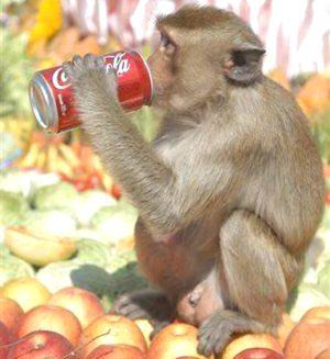 ave inserted an image of a monkey drinking out of a coca-cole can. This image contains degrees of both redundancy and entropy, but it is more entropic. Monkey's are highly entropic animals as their actions are highly unpredictable and very random and they keep surprising man more and more by becom
 ing more able each day because of their high degree of intelligence. In this particular image it contains a high degree of entropy as it is unpredictable that a monkey should be drinking a can of coca-cole which you would not normally asociate a monkey drinking with only a human.
 ave inserted an image of a monkey drinking out of a coca-cole can. This image contains degrees of both redundancy and entropy, but it is more entropic. Monkey's are highly entropic animals as their actions are highly unpredictable and very random and they keep surprising man more and more by becom
 ing more able each day because of their high degree of intelligence. In this particular image it contains a high degree of entropy as it is unpredictable that a monkey should be drinking a can of coca-cole which you would not normally asociate a monkey drinking with only a human.
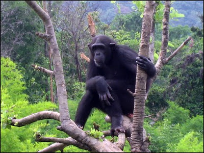
 On the other hand, the other image I have inserted of a monkey in a tree has a high degree of redundancy as the monkey is placed in a predicatble environment whilst doing what people would predict a monkey to be doing, swinging through trees in a rainforest.
Within my project I there are purposley different degrees of both redundancy and entropy but also some parts which i have only realised since learning about redundancy and entropy that contain degrees of both because of the way i am trying to communicate and attract my target audience.
One way I have done this is by realising that the way i am hoping to mix animation with real life images and video has a degree redundancy within it as there are real life children waving out of windows. But, there is also a degree of entorpy and the animations around the window are not things you would normally asociate of being around a window like stars flying around for example which are an unpredictable factor within the project and therefore contain a degree of entropy.
One way I have done this is by realising that the way i am hoping to mix animation with real life images and video has a degree redundancy within it as there are real life children waving out of windows. But, there is also a degree of entorpy and the animations around the window are not things you would normally asociate of being around a window like stars flying around for example which are an unpredictable factor within the project and therefore contain a degree of entropy.
I have also noticed that I have used a high degree of redundancy within my project which enables me to interact with my target audience and make the genre clear to them as genre is dependant on high degrees of redundancy. This also helps to make sure it's clear and predictable of what to expect my project to contain in relation to other simliar children's TV dramas. For this I will use similar aspects used in other children's TV dramas to create a degree of redundancy.
I have also realised although I have made it easy to target my audince and to make it predictable and create expectations of my project I have not made any part of the project unique and to create this I will have to include a high degree of entropy at a certain point in my project and something unpredictable to make it more interesting for my audience.
Auteur Theory
"Autheurism" is the method of analyzing films based on this theory or, alternately, the characterstics of a director's work that makes him an Auteur".
The Auteur theory focusses on an individual's stylistic features, how texts are determined by an artists' creativity and how texts emerge as part of an artists body of work.
Since starting Media Studies I believe that within my work I have developed an original style. I consider all of my work as products of my individual creativity.
I think that my work has developed gfrom AS to A2 in some ways but there is also a personal individual style which has influenced my work through out all of the work I have completed.
I think that the way in which I use and develop my ideas for a project have developed because I have become able to take an idea but also add to it and experiment with it more to improve it. I did this when thinking up the typical stereotype of a boy who would read my hip hop/grime magazine I was creating. After coming up with various ideas I used a block of flats to represent the nature of the magazine after researching into other similar ones would be for a young boy, troubled and from quite a poor family. I then developed my idea of using the flats as a "rough" looking image and improved it by adding darkened effects and shaddows to portray a dark and gloomy look maybe like the life of someone who had to live there. I think this was a good way of following generic conventions specifically for my magazine.
The way in which my work has also developed in every piece of work completed so far is in the way in which I have been influenced by researching into my target audience for the project. I have been able to research into the target auience in much more depth and therefore relating my work to my target auience much easier. I feel each piece of work I have been more and more specific with my target audince and representing that within my project it has enabled me to realise the different styles and originality that need to be used depending on the audience I am targeting.
Friday, 9 October 2009
Treatment
Title/Location
Our working title for our children’s TV drama opening sequence is ‘Park Acre’. We have chosen this name so far because this is the name of the house which will be used as the location of the shooting of the opening sequence.
Concept
The concept of it will be a happy atmosphere and almost dream like in the view of two adopted children.
We chose to create an opening like this because after much research into popular children’s TV dramas we came to the conclusion that the majority involved a happy and ‘feel good’ atmosphere which children would enjoy.
We hope to be able to compete with shows like ‘Tracy Beaker’ and ‘My Parent’s Are Aliens’ as we will aiming to follow the same sort of plot and atmosphere both use and achieve.
Who/When/Where/Why
We will aim our children’s TV drama at children from the ages of 5-12 as we will play the programme on children’s TV at peak times before and after the academic primary school day. Therefore we will be targeting the middle class family where the parents have graduated and are quite high in the social Jincar’s scale around C1 and C2 as we hope for the programme to teach children life skills at the same time as being fun to watch. One way we will try and achieve this is by discreetly inserting social and life skills to learn from and set an example to what people should behave like within the TV drama. We will also include a mixture of animation and real life shots to keep the fun factor alive.
What's Different?
We wanted to be slightly different than the dramas we researched into by taking it one step along the time line where kids had been in a dream home and happy where as ‘Tracy Beaker’ wants out of the home she is in with her temporary foster mum and the kids in ‘My Parents Are Aliens’ want out because their parent’s are ‘bonkers’.
Technology & Equiptment
We will be using a lot of new technology to create the perfect opening we aim to make. We will be using video cameras to record short clips or the two boys very happy doing activities people in a children’s wouldn’t ever dream about doing in their lifetime like splashing in a Jacuzzi and playing on a proper football pitch. We will also be using a programme to create our opening sequence soundtrack called ‘Cubase’ which is currently being developed. We will be shooting one shot in a dark room with disco lights and smoke machines which will need extra lighting to catch the characters perfectly so we shall be using professional lighting to create this effect.
Who's Doing What?
I will be filming the sequences while Rich directs the characters to the right places and we shall both be developing and putting the sequence together and sharing ideas for improvements throughout the process.
Schedule
We don’t have a schedule yet for filming but we estimate it will take a whole day to complete filming but contacting the characters we will be using won’t be hard as they live next door to me.
Possible Problems
We don’t expect any problems as such yet but time will show if we do run into any or not.
We do not predict and financial costs either only a bottle of ‘Fairy Liquid’ to fill the Jacuzzi with bubbles to create an even more exciting and happy atmosphere.
Friday, 2 October 2009
Pitch Comments
During our pitches the audience were given sheets in which to make comments on a series of questions given related to our pitch..
After the pitch we were given these anonymous comments back to use to help develop and improve our ideas for our coursework.
We received many good comments on our ideas but here are a few of the ideas given to us on how to improve and our response to them.
We were asked by someone if we had permission by the parents of the two children in which we will be using in our children's TV drama opening sequence. We forgot to add this within our pitch and therefore have enclosed the letter given to and signed by the parent's of the two boys allowing us permission for them to be filmed.
Someone also commented on that researching for a soundtrack for our opening sequence may be time consuming if we cannot find something suitable. We have already considered this and said if we cannot find one before we start filming then we shall make one ourselves using a programme called 'Cubase'. However we recently found a great site with a vast number of non copyright music split into sub genres. There are one or two songs on here that we think could be used for our title sequence. We will still play around on cubase and keep our eyes open to any sites hosting non copyright music to give ourselves the best opportunity to finding the right music.
We received a comment about the achievability of the animation idea. We realise its not going to be easy however we have the right software and the right help to make it easily achievable. It will take a fair amount of time and effort however we are willing to put in the effort as we think it will look great.
We had a question in our feedback asking if we knew how to edit footage and the title sequence cartoon effect. We have already created a mock idea using a house, this is in the blog and on youtube already
Friday, 18 September 2009
Pitch Coursework Idea
For my A2 coursework i have decidecided to choose childrens tv drama. This involves creating a short title sequence, a magazine advert and a DVD cover.
We researched into existing childrens tv drama's. We looked at the layout, time span and music. We found that all title sequences last for an average of 23 seconds.
Tracy Beaker was amongst the title sequences we watched. We liked the idea of a border around the main sequence with the mix of real life images with animation.
We also saw this technique used in 'My Parents Are Aliens' and liked it. However we would be happier just using a number of still images montaged together to make a moving image.
Subscribe to:
Comments (Atom)

